tidymatrix does not have its own plotting system. Instead it makes it easy to get the data into the shape that plotting packages expect:
- the metadata (with PC scores, cluster labels, test results, …) is a data frame, ready for ggplot2;
-
to_long()gives one row per matrix cell with all metadata attached, for plots of the individual values; -
plot_pheatmap()draws a heatmap of the matrix with the metadata as annotations.
The same tools get the data out of R, which is covered at the end.
library(tidymatrix)
library(dplyr, warn.conflicts = FALSE)Data
We use the big5 personality survey (see
?big5): careless respondents removed, reverse-keyed items
re-scored, and a score per trait added to the respondent metadata. The
Matrix operations and Row- and column-wise statistics
vignettes explain these steps.
tm <- tidymatrix(big5_responses, big5_respondents, big5_items) |>
  activate(rows) |>
  filter(completion_min > 3.5) |>
  transform_matrix(\(x, flip) ifelse(flip, 6L - x, x), flip = reversed) |>
  compute_across(
    \(answers, items) tapply(answers, items$trait, mean),
    add_to_data = TRUE,
    prefix = "score"
  ) |>
  mutate(age_group = cut(
    age,
    breaks = c(17, 29, 49, 64, Inf),
    labels = c("18-29", "30-49", "50-64", "65+")
  )) |>
  compute_prcomp(n_components = 2, store = FALSE) |>
  activate(columns) |>
  compute_prcomp(n_components = 2, store = FALSE)
The two compute_prcomp() calls add principal component
scores to the respondent and item metadata. store = FALSE
skips storing the full prcomp objects, which we do not need
here.
Plotting metadata
PCA of respondents
After compute_prcomp(), the PC scores are columns of the
row metadata. Plot them with as_tibble() and ggplot2, and
colour by any other variable:
tm |>
  activate(rows) |>
  as_tibble() |>
  ggplot(aes(row_pca_PC1, row_pca_PC2, colour = score_Neuroticism)) +
  geom_point() +
  scale_colour_viridis_c() +
  labs(x = "PC1", y = "PC2", colour = "Neuroticism")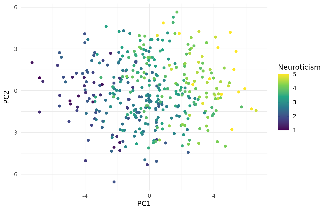
PCA of items
With columns active, items become points. Labelling them with their IDs shows that items of the same trait group together:
tm |>
  activate(columns) |>
  as_tibble() |>
  ggplot(aes(column_pca_PC1, column_pca_PC2, colour = trait)) +
  geom_text(aes(label = item_id)) +
  labs(x = "PC1", y = "PC2", colour = NULL)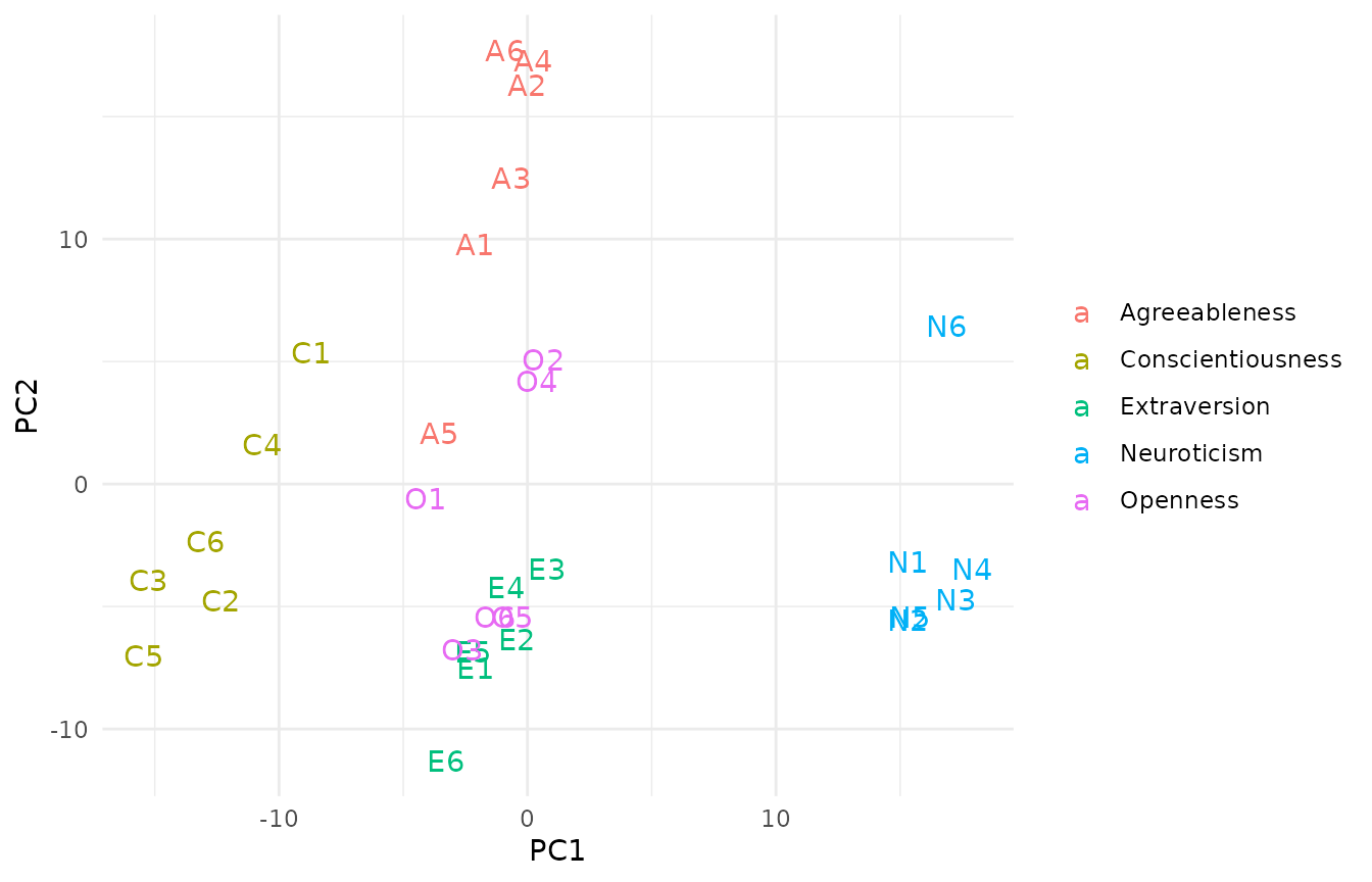
Relationships between metadata variables
Trait scores computed from the matrix sit next to the demographics, so their relationship is a regular scatterplot:
tm |>
  activate(rows) |>
  as_tibble() |>
  ggplot(aes(age, score_Conscientiousness)) +
  geom_jitter(height = 0.05, alpha = 0.5) +
  geom_smooth(method = "lm", formula = y ~ x) +
  labs(x = "Age", y = "Conscientiousness score")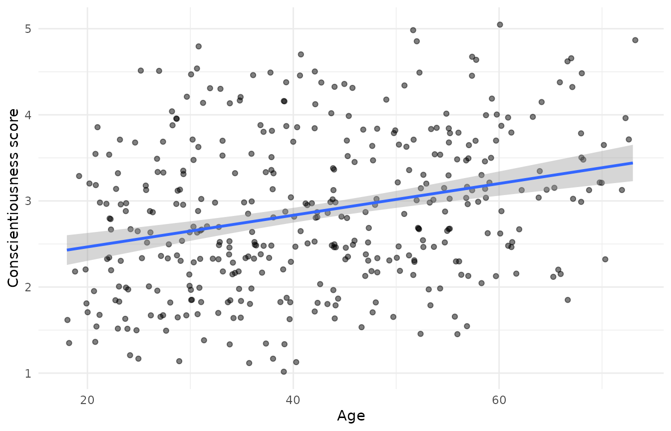
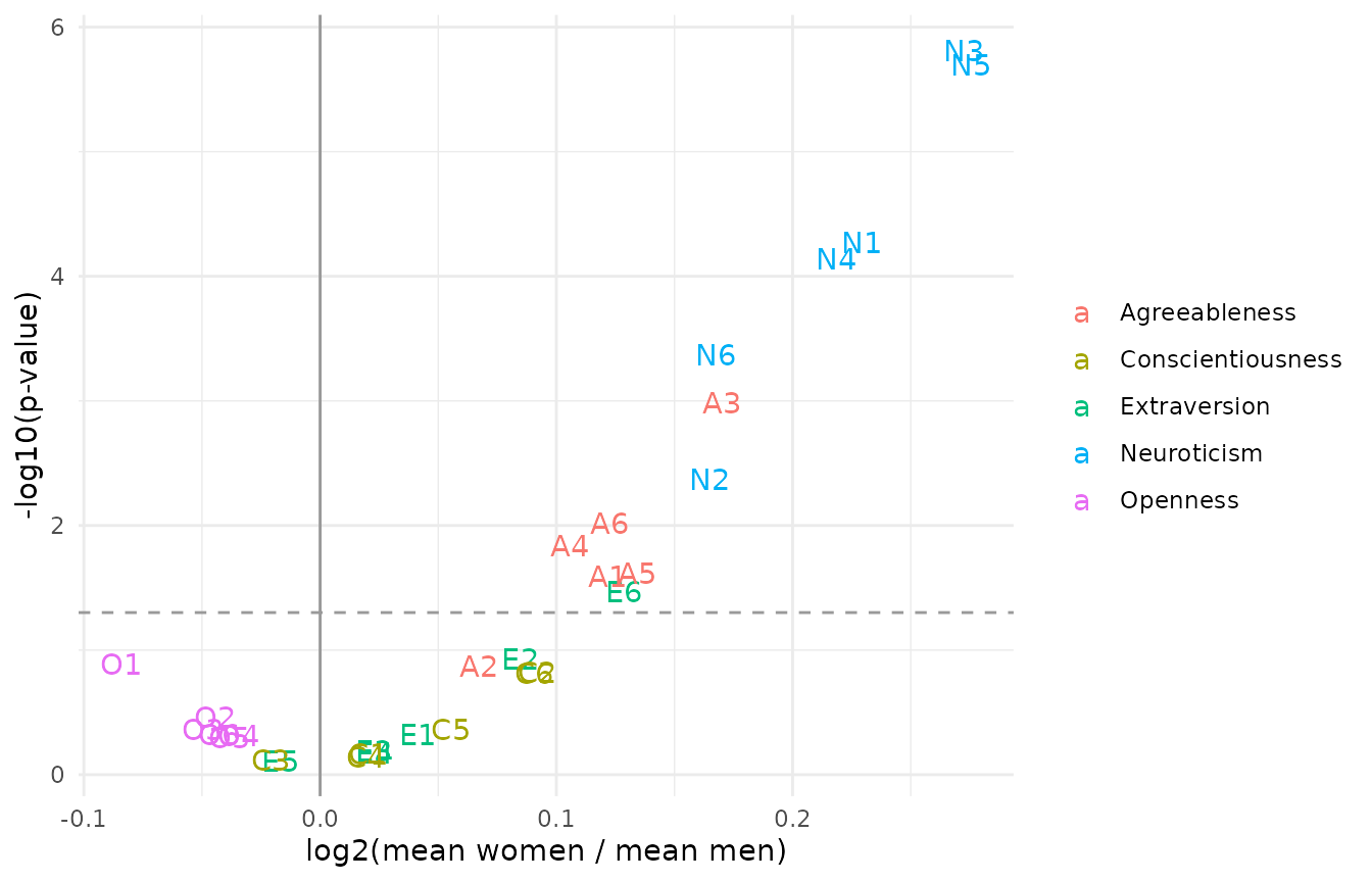
Test results
Results of compute_ttest() and friends are tibbles with
the item metadata included, so a volcano plot takes a few lines:
tm |>
  activate(rows) |>
  filter(gender %in% c("Female", "Male")) |>
  activate(columns) |>
  compute_ttest(group_col = "gender", control = "Male", treatment = "Female") |>
  ggplot(aes(log2fc, -log10(p.value), colour = trait)) +
  geom_hline(yintercept = -log10(0.05), linetype = "dashed", colour = "grey60") +
  geom_vline(xintercept = 0, colour = "grey60") +
  geom_text(aes(label = item_id)) +
  labs(
    x = "log2(mean women / mean men)",
    y = "-log10(p-value)",
    colour = NULL
  )
Plotting individual values with to_long()
to_long() converts the whole tidymatrix into a long
table: one row per cell, with the row metadata, the column metadata and
the value.
long <- to_long(tm)
dim(long)
#> [1] 11640    24
long |> select(respondent_id, gender, age_group, item_id, trait, value)
#> # A tibble: 11,640 × 6
#>    respondent_id gender age_group item_id trait        value
#>    <chr>         <chr>  <fct>     <chr>   <chr>        <int>
#>  1 R001          Female 50-64     E1      Extraversion     4
#>  2 R002          Female 30-49     E1      Extraversion     2
#>  3 R003          Male   65+       E1      Extraversion     2
#>  4 R004          Male   30-49     E1      Extraversion     2
#>  5 R005          Female 30-49     E1      Extraversion     1
#>  6 R006          Female 50-64     E1      Extraversion     1
#>  7 R007          Female 18-29     E1      Extraversion     3
#>  8 R008          Female 30-49     E1      Extraversion     2
#>  9 R009          Male   50-64     E1      Extraversion     4
#> 10 R010          Female 50-64     E1      Extraversion     4
#> # ℹ 11,630 more rows
If a column name occurs in both the row and the column metadata, all
columns are prefixed with row. and col. to
keep them apart.
From here, any ggplot is possible. The distribution of answers to the neuroticism items, by gender:
long |>
  filter(trait == "Neuroticism", gender != "Non-binary") |>
  count(item_id, gender, value) |>
  group_by(item_id, gender) |>
  mutate(share = n / sum(n)) |>
  ggplot(aes(factor(value), share, fill = gender)) +
  geom_col(position = "dodge") +
  facet_wrap(~item_id) +
  labs(x = "Answer (re-scored)", y = "Share of respondents", fill = NULL)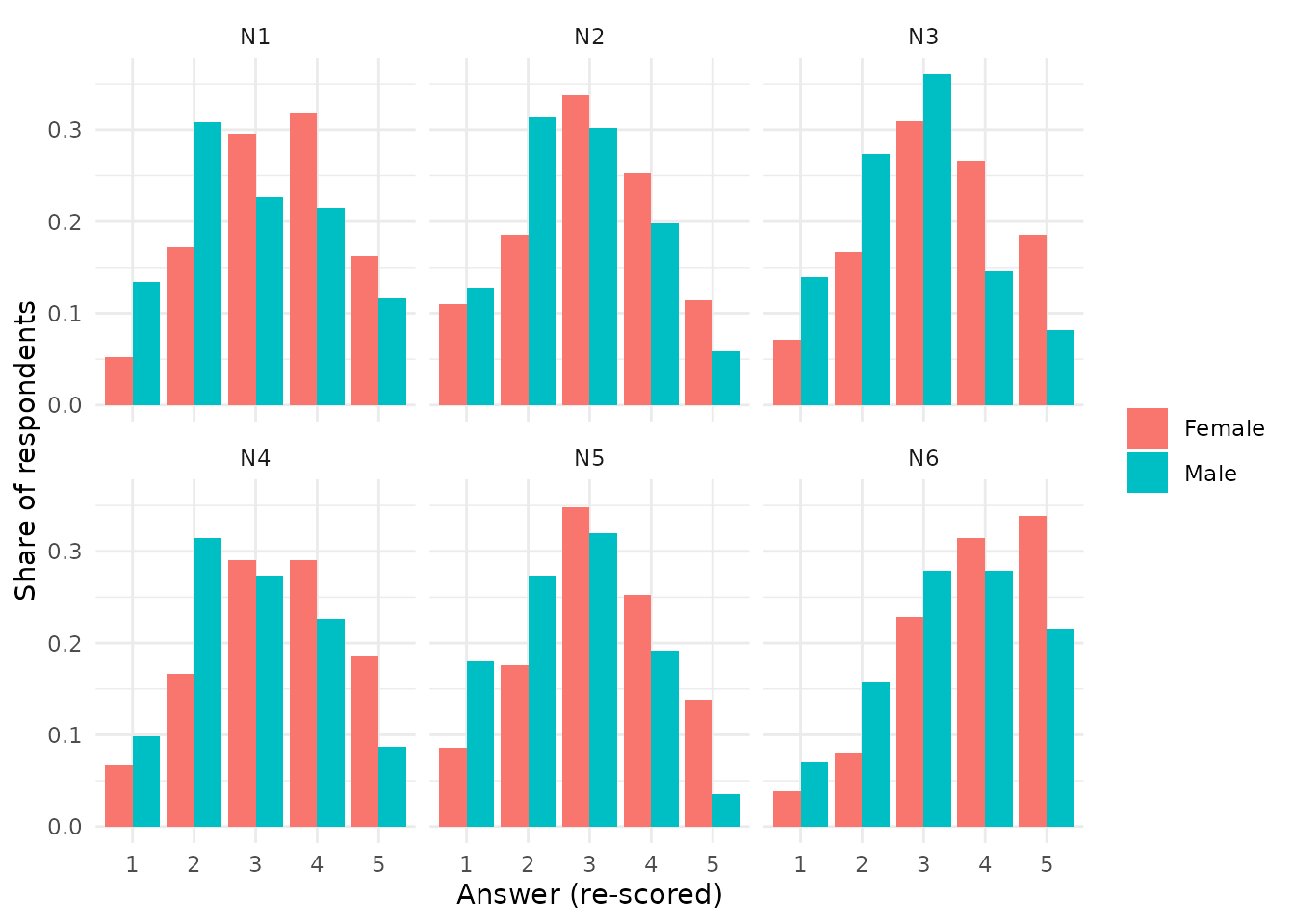
Average answers per item and age group:
long |>
  group_by(trait, item_id, age_group) |>
  summarise(mean = mean(value), .groups = "drop") |>
  ggplot(aes(age_group, mean, group = item_id, colour = trait)) +
  geom_line() +
  facet_wrap(~trait, nrow = 1) +
  labs(x = "Age group", y = "Mean answer") +
  theme(legend.position = "none", axis.text.x = element_text(angle = 45))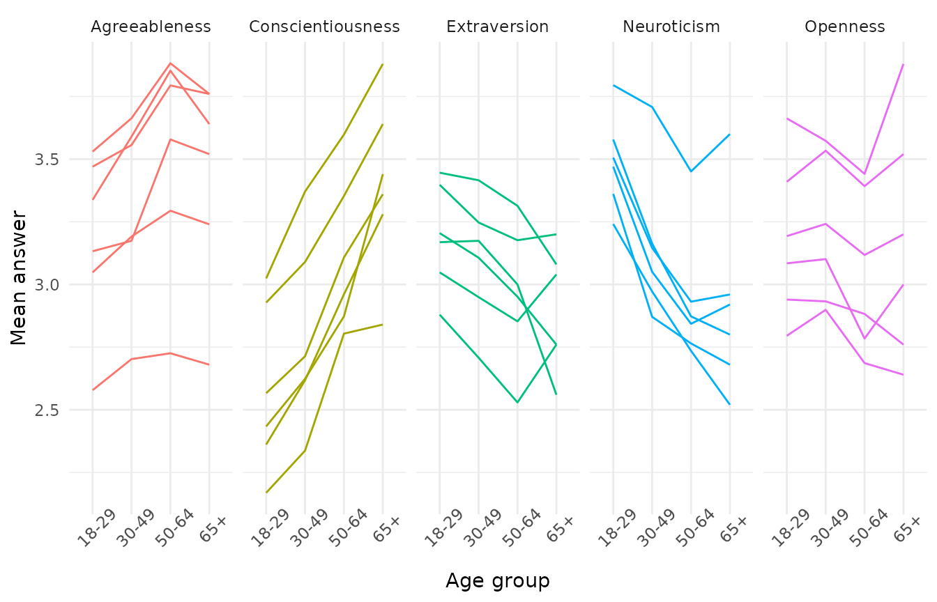
to_long() always converts the full matrix. Filter the
tidymatrix first to keep the long table small.
Heatmaps
plot_pheatmap() passes the matrix to
pheatmap::pheatmap() and fills in the annotations and
clusterings from the tidymatrix:
-
row_namesandcol_nameschoose the metadata columns used as labels; -
row_annotationandcol_annotationchoose the metadata columns shown as colour bars (by default all of them,FALSEfor none); - if a stored
compute_hclust()result exists for rows or columns, it is used to order them.TRUElets pheatmap cluster,FALSEturns clustering off; - all other arguments go to
pheatmap::pheatmap().
Respondents × items
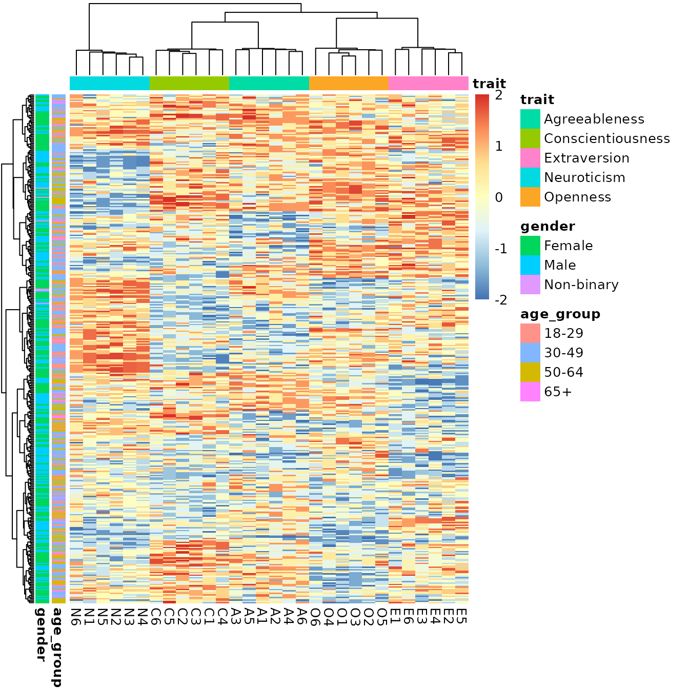
Standardising the items and clipping extreme values gives a readable
colour scale. Clustering both dimensions with
compute_hclust() makes the trait structure visible:
tm |>
  activate(columns) |>
  scale() |>
  activate(matrix) |>
  clip_values(min = -2, max = 2) |>
  activate(columns) |>
  compute_hclust(method = "ward.D2") |>
  activate(rows) |>
  compute_hclust(method = "ward.D2") |>
  plot_pheatmap(
    col_names = "item_id",
    row_annotation = c("age_group", "gender"),
    col_annotation = "trait",
    show_rownames = FALSE,
    treeheight_row = 20
  )
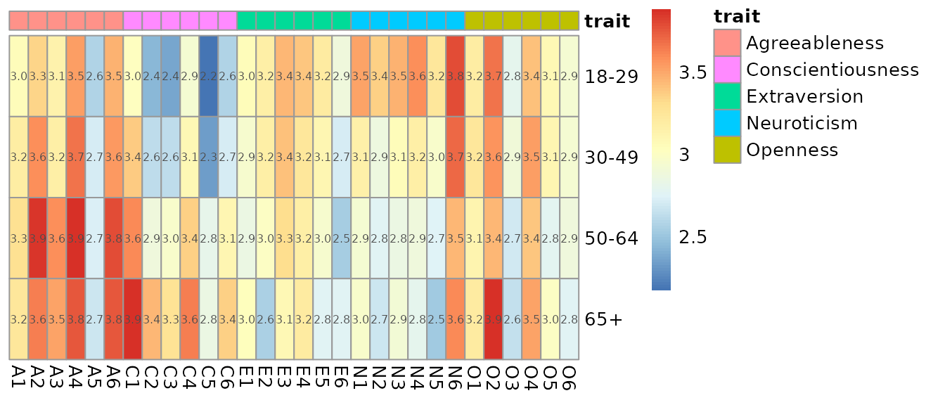
Aggregated heatmap
A heatmap does not need to show the raw data. Summarising the respondents by age group gives a compact overview, here in questionnaire order and without clustering:
tm |>
  activate(rows) |>
  group_by(age_group) |>
  summarise(n = n()) |>
  activate(columns) |>
  arrange(trait, item_id) |>
  plot_pheatmap(
    row_names = "age_group",
    col_names = "item_id",
    row_annotation = FALSE,
    col_annotation = "trait",
    row_cluster = FALSE,
    col_cluster = FALSE,
    display_numbers = TRUE,
    number_format = "%.1f",
    fontsize_number = 6
  )
Exporting
The matrix
pull_active() returns the active component. With the
matrix active, that is a plain matrix:
m <- tm |>
  activate(matrix) |>
  pull_active()

m[1:3, 1:6]
#>      E1 E2 E3 E4 E5 E6
#> R001  4  3  5  3  3  2
#> R002  2  4  2  2  3  2
#> R003  2  2  3  4  2  3
The metadata
With rows or columns active, pull_active(),
as.data.frame() and as_tibble() return the
metadata, including anything added by analyses:
tm |>
  activate(rows) |>
  as_tibble() |>
  select(respondent_id, starts_with("score_"), starts_with("row_pca"))
#> # A tibble: 388 × 8
#>    respondent_id score_Agreeableness score_Conscientiousness score_Extraversion
#>    <chr>                       <dbl>                   <dbl>              <dbl>
#>  1 R001                         3.33                    1.5                3.33
#>  2 R002                         2.83                    2.67               2.5
#>  3 R003                         3.33                    2.17               2.67
#>  4 R004                         2.83                    2.5                2.67
#>  5 R005                         4.83                    3.67               1.33
#>  6 R006                         4                       2.17               2.5
#>  7 R007                         4.83                    3.17               3
#>  8 R008                         3                       2.33               2.67
#>  9 R009                         4.5                     3.83               2.67
#> 10 R010                         3.67                    4.67               4.17
#> # ℹ 378 more rows
#> # ℹ 4 more variables: score_Neuroticism <dbl>, score_Openness <dbl>,
#> #   row_pca_PC1 <dbl>, row_pca_PC2 <dbl>
Everything at once
to_long() is the most complete export: every value
together with all its metadata, in a format that spreadsheets, databases
and other tools understand.
out <- tempfile(fileext = ".csv")

tm |>
  activate(columns) |>
  select(item_id, trait, item_text) |>
  activate(rows) |>
  select(respondent_id, age, gender, country) |>
  to_long() |>
  write.csv(out, row.names = FALSE)

read.csv(out, nrows = 3)
#>   respondent_id age gender country item_id        trait
#> 1          R001  52 Female      EE      E1 Extraversion
#> 2          R002  32 Female      FI      E1 Extraversion
#> 3          R003  66   Male      EE      E1 Extraversion
#>                           item_text value
#> 1 I feel comfortable around people.     4
#> 2 I feel comfortable around people.     2
#> 3 I feel comfortable around people.     2
The first two steps keep only the metadata columns that are needed; the matrix is not affected.
To save the tidymatrix itself, including stored analyses, use
saveRDS() and readRDS().